Lesson 1.1: line plot 折線圖
畫出折線圖,並存成html檔
Example Code
from bokeh.plotting import figure, output_file, show
x = range(0,10)
y = [1, 3, 2, 4, 5, 7, 6, 8, 9, 10]
output_file("BokehLinePlot.html")
p = figure(title="line plot", x_axis_label='x', y_axis_label='y')
p.line(x, y, legend="Temp.", line_width=2)
show(p)
Note and Comments
from bokeh.plotting import figure, output_file, show :匯入bokeh函式庫.
x = range(0,10) : 產生0-9的x軸資料.
y = [1, 3, 2, 4, 5, 7, 6, 8, 9, 10] : 產生0-9的y軸資料.
output_file("BokehLinePlot.html")  : 設定匯出的html名稱, 如不設定這行將不會儲存html,只會在web brower中顯示
p = figure(title="line plot", x_axis_label='x', y_axis_label='y') : 設定圖形基本框架資料, title:標題, x_axis_label:x軸名稱, , y_axis_label:y軸名稱
p.line(x, y, legend="Temp.", line_width=2) : 繪製折線圖, 函數原形為: p.line(x軸資料, y軸資料, 圖例, 線寬)
show(p)
result
點下列圖形可直接觀看顯示結果.
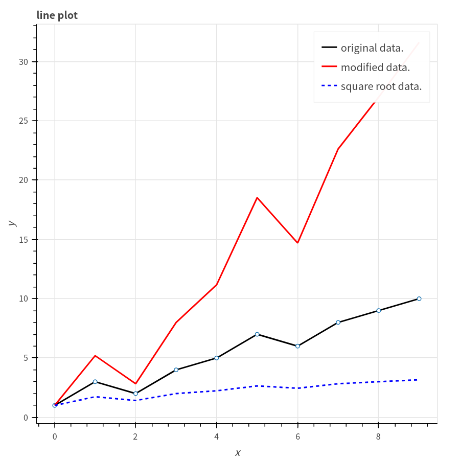
 Lesson 1.2: 繪製多條折線圖
Example Code
Lesson 1.2: 繪製多條折線圖
Example Code
from bokeh.plotting import figure, output_file, show
import scipy as sp
x = sp.arange(0,10)
y = sp.array([1, 3, 2, 4, 5, 7, 6, 8, 9, 10])
y2 = y**1.5
y3 = pow(y, 0.5)
output_file("BokehLinePlot2.html")
p = figure(title="line plot", x_axis_label='x', y_axis_label='y')
p.line(x, y, legend="original data.", line_color="black", line_width=2)
p.circle(x, y, fill_color="white", size=10)
p.line(x, y2, legend="modified data.", line_color="red", line_width=2)
p.line(x, y3, legend="square root data.", line_color="blue", line_dash="4 4", line_width=2)
show(p)
Note and Comments
from bokeh.plotting import figure, output_file, show :匯入bokeh函式庫.
import scipy as sp :匯入scipy函式庫.
x = sp.arange(0,10)  :利用scipy函式庫中的arange函式產生0-9的數列, 我們將設定此數列為X軸.
y = sp.array([1, 3, 2, 4, 5, 7, 6, 8, 9, 10]) :利用scipy函式庫中的array函式產生y軸數據.
y2 = y**1.5 :scipy array的"廣播"的特性, 可直接對每一個元素做運算, 在此將每一個元素設定為原值的1.5次方
y3 = y**0.5 :scipy array的"廣播"的特性, 將每一個元素設定為原值的方根
output_file("BokehLinePlot2.html") : 設定匯出的html名稱
p = figure(title="line plot", x_axis_label='x', y_axis_label='y') : 設定圖形基本框架資料, title:標題, x_axis_label:x軸名稱, , y_axis_label:y軸名稱
p.line(x, y, legend="original data.", line_color="black", line_width=2) : 繪製折線圖, line_color可設定折線圖顏色
p.circle(x, y, fill_color="white", size=10) : 利用散佈圖繪製標記(Marker), fill_color可設定圓圈標記內的顏色, size為標記大小
p.line(x, y2, legend="modified data.", line_color="red", line_width=2)
p.line(x, y3, legend="square root data.", line_color="blue", line_dash="4 4", line_width=2)
show(p)
點下列圖形可直接觀看顯示結果.
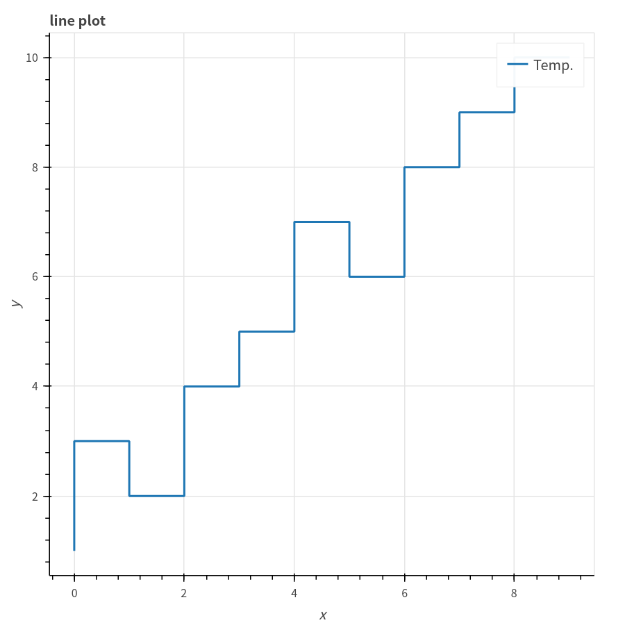
Lesson 1.3: step plot
畫出step plot
Example Code
from bokeh.plotting import figure, output_file, show
x = range(0,10)
y = [1, 3, 2, 4, 5, 7, 6, 8, 9, 10]
output_file("BokehLinePlot.html")
p = figure(title="line plot", x_axis_label='x', y_axis_label='y')
p.step(x, y, legend="Temp.", line_width=2)
show(p)
Note and Comments
from bokeh.plotting import figure, output_file, show :匯入bokeh函式庫.
x = range(0,10) : 產生0-9的x軸資料.
y = [1, 3, 2, 4, 5, 7, 6, 8, 9, 10] : 產生0-9的y軸資料.
output_file("BokehLinePlot.html")  : 設定匯出的html名稱
p = figure(title="line plot", x_axis_label='x', y_axis_label='y') : 設定圖形基本框架資料, title:標題, x_axis_label:x軸名稱, , y_axis_label:y軸名稱
p.line(x, y, legend="Temp.", line_width=2) : 繪製step, 函數原形為: p.step(x軸資料, y軸資料, 圖例, 線寬)
show(p)
result
點下列圖形可直接觀看顯示結果.