Lesson 09 change the scale of axis 依資料作圖並更改座標軸格式
依資料作圖並更改座標軸格式
 Code
Code
- import numpy as np
- import matplotlib.pyplot as plt
- # Fixing random state for reproducibility
- np.random.seed(1)
- # make up some data in the interval [0, 1]
- generatedN=10000
- y = np.random.rand(generatedN)
- # plot the distribution
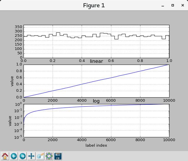
- plt.subplot(311)
- #n, bins, patches = plt.hist(y, 50, normed=1, facecolor='g', alpha=0.75)
- binning=40
- plt.hist(y, binning, histtype='step',color='black', normed=False)
- plt.axis([0, 1, 0, int(generatedN/binning*1.5)])#int(max(y))+1])
- plt.grid(True)
- #sort the y data
- y.sort()
- x = np.arange(len(y))
- # linear
- plt.subplot(312)
- plt.plot(x, y)
- plt.yscale('linear')
- plt.title('linear')
- plt.ylabel('value')
- plt.grid(True)
- # log
- plt.subplot(313)
- plt.plot(x, y)
- plt.yscale('log')
- plt.title('log')
- plt.xlabel('label index')
- plt.ylabel('value')
- plt.grid(True)
- plt.show()
Note and Comments
- np.random.seed(n) 設定使用亂數種子n
- y.sort() 將資料y內的數值依大小排序並將y的內容中設爲排序後的結果, sorted(y) 將資料y內的數值依大小排序並將排序後的結果回傳
- np.arange(m) 產生m個資料的數列, 數列內容爲0到m-1
- np.arange(m, n) 產生n-m個資料的數列, 數列內容爲m到n-1
- plt.yscale('linear') 指定y軸的格式是線性格式
- plt.yscale('log') 指定y軸的格式是對數格式