Lesson 07: 1D plots with random function which follow the normal distribution
依據常態分佈產生隨機亂數並作圖
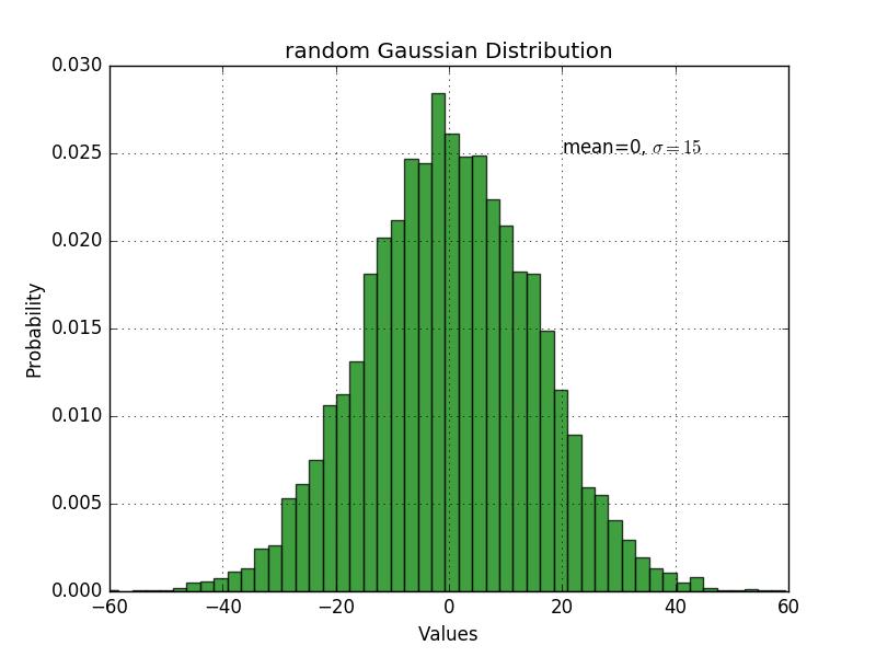
Example Code
- import numpy as np
- import matplotlib.pyplot as plt
- mean, sigma = 0, 15
- x = mean + sigma * np.random.randn(10000)
- n, bins, patches = plt.hist(x, 50, normed=1, facecolor='g', alpha=0.75)
- plt.xlabel('Values')
- plt.ylabel('Probability')
- plt.title('random Gaussian Distribution')
- plt.text(20, .025, r'mean=0, $\sigma=15$')
- plt.axis([-60, 60, 0, 0.03])
- plt.grid(True)
- plt.show()
Note and Comments
- import matplotlib.pyplot as plt 匯入圖形函式庫Matplotlib中的pyplot資料庫, 並命名爲plt 產生m個0到1的隨機數
- np.random.randn(m); 依常態分佈生成m個亂數資料點
- np.random.randn(n,m); 依常態分佈生成n組亂數, 每組亂數有m個資料點
- sigma * np.random.randn(m) + mean; 依常態分佈生成m個亂數資料, 其中標準差是sigma, mean是資料平均值,也就是N(mean,sigma)
- plt.ylabel('count') 設定y軸的名稱, plt.xlabel('count') 設定x軸的名稱
- plt.hist(x, bins=10, histtype='bar', normed=False) 以x爲資料繪一維長條圖
- histtype='xxxx' 設定長條圖的格式: bar與stepfilled爲不同形式的長條圖, step以橫線標示數值.
- bin(n) 資料有n個binning(x軸切成n等分累積畫圖),
- normed=False, 資料在作圖時不作歸一化.normed=True, 資料在作圖時歸一化. True=1; False=0;
- plt.text(20, .025, r'mean=0, $\sigma=15$') 在座標(20,0.025)的位置擺放文字
- plt.axis([-60, 60, 0, 0.03]) X與Y軸的範圍
- plt.grid(bool) 是否設置格線. bool=False 不使用. bool=True 使用
- plt.legend(["xxx"]); 設定圖例
- plt.show() 圖形設定完畢,開始作圖
result